Data is a valuable asset – so much so that it’s the world’s most valuable resource. That makes understanding the different types of data – and the role of a data scientist – more important than ever. In the business world, more companies are trying to understand big numbers and what they can do with them. Expertise in data is in high demand. Determining the right data and measurement scales enables companies to organise, identify, analyse and ultimately use data to inform strategies that will allow them to make a genuine impact.
For professionals with a background in a related field looking to formalise their data science skills, UNSW Online's Graduate Certificate in Data Science provides a flexible way to build foundational expertise in data, statistics and programming.
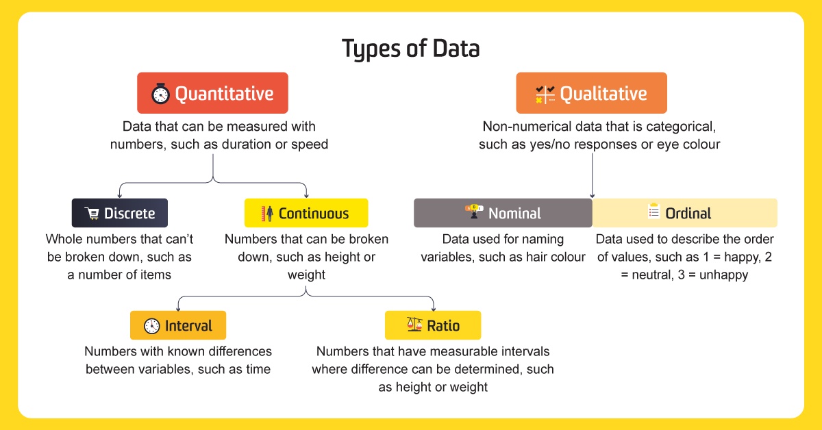
Data at the highest level: Qualitative and quantitative
What is data? In short, it’s a collection of measurements or observations, divided into two different types: qualitative and quantitative.
Qualitative data refers to information about qualities, or information that cannot be measured. It’s usually descriptive and textual. Examples include someone’s eye colour or the type of car they drive. In surveys, it’s often used to categorise ‘yes’ or ‘no’ answers.
Quantitative data is numerical. It’s used to define information that can be counted. Some examples of quantitative data include distance, speed, height, length and weight. It’s easy to remember the difference between qualitative and quantitative data, as one refers to qualities and the other refers to quantities.
A bookshelf, for example, may have 100 books on its shelves and be 100 centimetres tall. These are quantitative data points. The colour of the bookshelf – red – is a qualitative data point.
What is quantitative (numerical) data?
Quantitative, or numerical, data can be broken down into two types: discrete and continuous.
Discrete data
Discrete data is a whole number that can’t be divided or broken into individual parts, fractions or decimals. Examples of discrete data include the number of pets someone has – one can have two dogs but not two-and-a-half dogs. The number of wins someone’s favourite team gets is also a form of discrete data because a team can’t have a half win – it’s either a win, a loss, or a draw.
Continuous data
Continuous data describes values that can be broken down into different parts, units, fractions and decimals. Continuous data points, such as height and weight, can be measured. Time can also be broken down – by half a second or half an hour. Temperature is another example of continuous data.
Discrete versus continuous
There’s an easy way to remember the difference between the two types of quantitative data: data is considered discrete if it can be counted and is continuous if it can be measured. Someone can count students, tickets purchased and books, while one measures height, distance and temperature.
What is qualitative (categorical) data?
Qualitative data describes the qualities of data points and is non-numerical. It’s used to define the information and can also be further broken down into sub-categories through the four scales of measurement.
Properties and scales of measurement
Scales of measurement is how variables are defined and categorised. Psychologist Stanley Stevens developed the four common scales of measurement: nominal, ordinal, interval and ratio. Each scale of measurement has properties that determine how to properly analyse the data. The properties evaluated are identity, magnitude, equal intervals and a minimum value of zero.
These measurement principles are also relevant in psychology, where students learn how research methods and data can be used to better understand human behaviour.
Properties of Measurement
- Identity: Identity refers to each value having a unique meaning.
- Magnitude: Magnitude means that the values have an ordered relationship to one another, so there is a specific order to the variables.
- Equal intervals: Equal intervals mean that data points along the scale are equal, so the difference between data points one and two will be the same as the difference between data points five and six.
- A minimum value of zero: A minimum value of zero means the scale has a true zero point. Degrees, for example, can fall below zero and still have meaning. But if you weigh nothing, you don’t exist.
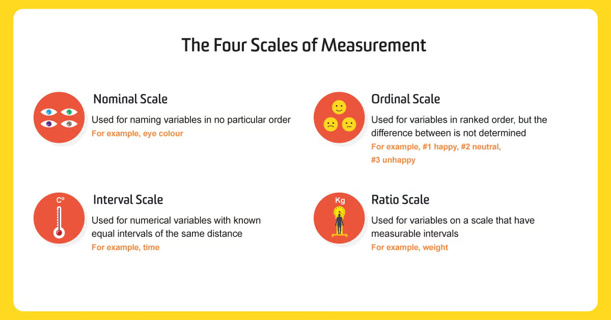
The four scales of measurement
By understanding the scale of the measurement of their data, data scientists can determine the kind of statistical test to perform.
1. Nominal scale of measurement
The nominal scale of measurement defines the identity property of data. This scale has certain characteristics, but doesn’t have any form of numerical meaning. The data can be placed into categories but can’t be multiplied, divided, added or subtracted from one another. It’s also not possible to measure the difference between data points.
Examples of nominal data include eye colour and country of birth. Nominal data can be broken down again into three categories:
- Nominal with order: Some nominal data can be sub-categorised in order, such as “cold, warm, hot and very hot.”
- Nominal without order: Nominal data can also be sub-categorised as nominal without order, such as male and female.
- Dichotomous: Dichotomous data is defined by having only two categories or levels, such as “yes’ and ‘no’.
2. Ordinal scale of measurement
The ordinal scale defines data that is placed in a specific order. While each value is ranked, there’s no information that specifies what differentiates the categories from each other. These values can’t be added to or subtracted from.
An example of this kind of data would include satisfaction data points in a survey, where ‘one = happy, two = neutral and three = unhappy.’ Where someone finished in a race also describes ordinal data. While first place, second place or third place shows what order the runners finished in, it doesn’t specify how far the first-place finisher was in front of the second-place finisher.
3. Interval scale of measurement
The interval scale contains properties of nominal and ordered data, but the difference between data points can be quantified. This type of data shows both the order of the variables and the exact differences between the variables. They can be added to or subtracted from each other, but not multiplied or divided. For example, 40 degrees is not 20 degrees multiplied by two.
This scale is also characterised by the fact that the number zero is an existing variable. In the ordinal scale, zero means that the data does not exist. In the interval scale, zero has meaning – for example, if you measure degrees, zero has a temperature.
Data points on the interval scale have the same difference between them. The difference on the scale between 10 and 20 degrees is the same between 20 and 30 degrees. This scale is used to quantify the difference between variables, whereas the other two scales are used to describe qualitative values only. Other examples of interval scales include the year a car was made or the months of the year.
4. Ratio scale of measurement
Ratio scales of measurement include properties from all four scales of measurement. The data is nominal and defined by an identity, can be classified in order, contains intervals and can be broken down into exact value. Weight, height and distance are all examples of ratio variables. Data in the ratio scale can be added, subtracted, divided and multiplied.
Ratio scales also differ from interval scales in that the scale has a ‘true zero’. The number zero means that the data has no value point. An example of this is height or weight, as someone cannot be zero centimetres tall or weigh zero kilos – or be negative centimetres or negative kilos. Examples of the use of this scale are calculating shares or sales. Of all types of data on the scales of measurement, data scientists can do the most with ratio data points.
To summarise, nominal scales are used to label or describe values. Ordinal scales are used to provide information about the specific order of the data points, mostly seen in the use of satisfaction surveys. The interval scale is used to understand the order and differences between them. The ratio scales gives more information about identity, order and difference, plus a breakdown of the numerical detail within each data point.
Using quantitative and qualitative data in statistics
Once data scientists have a conclusive data set from their sample, they can start to use the information to draw descriptions and conclusions. To do this, they can use both descriptive and inferential statistics.
Descriptive statistics
Descriptive statistics help demonstrate, represent, analyse and summarise the findings contained in a sample. They present data in an easy-to-understand and presentable form, such as a table or graph. Without description, the data would be in its raw form with no explanation.
Frequency counts
One way data scientists can describe statistics is using frequency counts, or frequency statistics, which describe the number of times a variable exists in a data set. For example, the number of people with blue eyes or the number of people with a driver’s license in the sample can be counted by frequency. Other examples include qualifications of education, such as high school diploma, a university degree or doctorate and categories of marital status, such as single, married or divorced.
Frequency data is a form of discrete data, as parts of the values can’t be broken down. To calculate continuous data points, such as age, data scientists can use central tendency statistics instead. To do this, they find the mean or average of the data point. Using the age example, this can tell them the average age of participants in the sample.
While data scientists can draw summaries from the use of descriptive statistics and present them in an understandable form, they can’t necessarily draw conclusions. That’s where inferential statistics come in.
Inferential statistics
Inferential statistics are used to develop a hypothesis from the data set. It would be impossible to get data from an entire population, so data scientists can use inferential statistics to extrapolate their results. Using these statistics, they can make generalisations and predictions about a wider sample group, even if they haven’t surveyed them all.
An example of using inferential statistics is in an election. Even before the entire country has voted, data scientists can use these kinds of statistics to make assumptions regarding who might win based on a smaller sample size.
Using data visualisation to communicate insights
Data visualisation describes the techniques used to create a graphic representation of a data sample by encoding it with visual pieces of information. It helps to communicate the data to viewers in a clear and efficient way.
Characteristics of effective graphical displays
Effective visualisation can help individuals analyse complex data values and draw conclusions. The goal of this process is to communicate findings as clearly as possible. A graphic display that features effective messaging will show the data clearly and allow the viewer to gain insights and trends from the data set and reveal the different findings between the data.

Data visualisation examples
The best visual representation of a data set is determined by the relationship data scientists want to convey between data points. Do they want to present the distribution with outliers? Do they want to compare multiple variables or analyse a single variable over time? Are they presenting trends in your data set? Here are some of the key examples of data visualisation.
- A bar chart is used to compare two or more values in a category and how multiple pieces of data relate to each other.
- A line chart is used to visually represent trends, patterns and fluctuations in the data set. Line charts are commonly used to forecast information.
- A scatter plot is used to show the relationship between data points in a compact visual form.
- A pie chart is used to compare the parts of a whole.
- A funnel chart is used to represent how data moves through different steps or stages in a process.
- A histogram is used to represent data over a certain time period or interval.
Quantitative messages
Quantitative messages describe the relationships of the data. Depending on the sample, there are different ways to communicate quantitative data.
- Nominal comparison: Sub-categories are individually compared in no particular order.
- Time series: An individual variable is tracked over a period of time, usually represented in a line chart.
- Ranking: Sub-categories are ranked in order, usually represented in a bar chart.
- Part-to-whole: Sub-categories are represented as a ratio in comparison with the whole, usually represented in a bar or pie chart.
- Deviation: Sub-categories are compared with a reference point, usually represented in a bar chart.
- Frequency distribution: Sub-categories are counted in intervals, usually represented in a histogram.
- Correlation: Two sets of measures are compared to identify if they move in the same or opposite directions, usually represented in a scatter plot.
Expand your data science expertise
With data science becoming a skill in even greater demand, now is a perfect time to expand your knowledge of the world’s most valuable resource: data. A degree in data science will enable you to identify, analyse and present complex and interwoven webs of data. You can then leverage these insights to make predictions and create strategies, specifically in a business environment. The UNSW Master of Data Science can give you the skills you need to unlock the power of data and help businesses make better decisions, empowering them to drive significant changes and results.
Categories